Making it shorter won’t save a paid spot that nobody understands. That’s the uncomfortable starting point for learning how to make a video ad that earns its next second, because length means little when the first frame gives a stranger no reason to stay.
Paid Viewers Owe the Ad Nothing
Popular advice treats a loud opening as proof of craft. Paid viewers didn’t choose your dynamic asset, didn’t agree to finish it, and won’t wait for a logo sting to explain why they should care. They can leave, scroll, or look away the moment the placement allows it, so the opening has to do real work before any brand sequence earns its place.
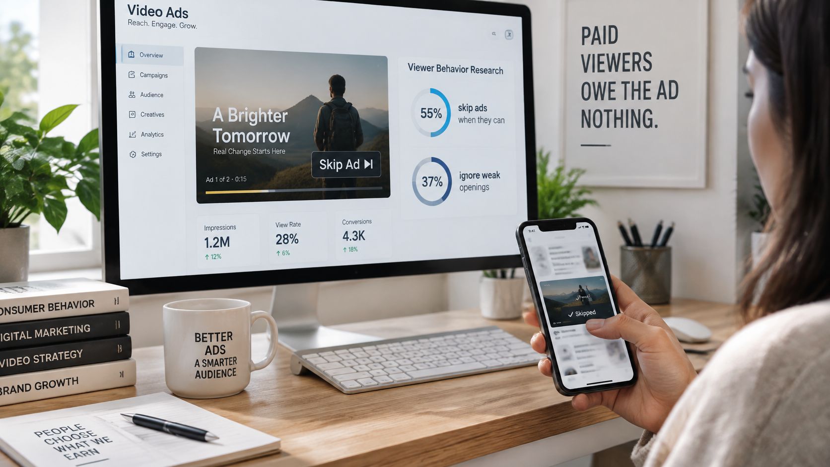
Consumer behavior makes that plain. The Deloitte Digital Media Trends survey found that 55% of people skip ads when possible and 37% ignore them entirely, while 78% say entertaining or interactive ads capture attention and 63% respond to informative or inspirational ads. Those figures don’t reward volume. They reward clarity, usefulness, and a situation a viewer can read at a glance.
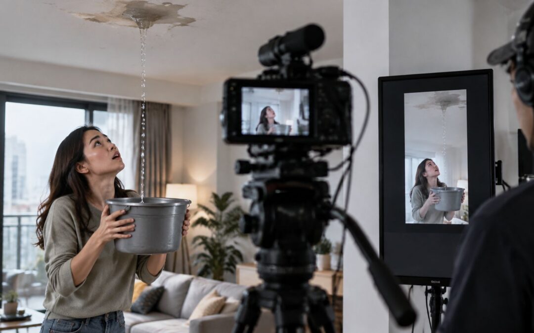
Say the advertiser sells renters insurance to apartment tenants. The film runs 15 seconds. From 0 to 2 seconds, the frame shows a stained ceiling, a drip falling into a pan, and a short caption naming a sudden leak. There’s no animated logo, no smiling presenter, and no vague promise about peace of mind.
That first frame carries the whole assignment.
Before a skip control appears, a tenant should be able to name three things. A leak has damaged the apartment. Renters, not homeowners in general, face the problem. Getting a quote is the next step. If any one of those points arrives late, the remaining seconds ask for patience the viewer never offered.
A slow brand intro fails for a simple reason. By the time the product context appears, the person has already decided the interruption isn’t for them. Completion data can hide that failure, because a finished view doesn’t prove the viewer understood the offer. Teams that want a cleaner read on finished views can measure VCR in Ads Manager, then judge the opening against the action that follows, not against views alone.
Freeze the ad at two seconds, mute it, and ask a stranger to explain the situation. If they can’t, the opening isn’t finished.
That freeze-frame test is strict, and that’s why it works. It catches ambiguous stock footage, decorative motion, and copy that sounds clever while saying nothing. It also protects trust, because a tenant can see the problem and the intended next step without feeling tricked into watching. A polished film still fails when its first meaningful information shows up after the viewer has gone.
Choose the One Action the Ad Must Drive
| Funnel job | Opening | Proof | On-screen action |
|---|---|---|---|
| Awareness | Stained ceiling, no price | Brand name held to the end | None, or a silent end card |
| Consideration | Leak named in the first line | Approved cover detail for sudden water damage | See what is covered |
| Purchase | Leak plus the quote verb early | One legal-approved trust line | Start your quote |
One table forces one decision. For the renters spot, the job is purchase intent, and the single action is a started quote recorded on the site. A view doesn’t count as success. A combined goal of awareness plus purchase doesn’t count either, because each job needs a different opening, different proof, and a different final instruction.
Google’s evidence supports that separation. The Google meta-analysis of 2,737 videos from 474 advertisers found that more than 80% of brands that succeeded with the same ad for one funnel objective did not reproduce that success for another objective, and Google research estimates that effective creative accounts for almost 50% of YouTube advertising ROI. Reusing one generic cut across the funnel isn’t efficient. It’s a way to blur every job at once.
Write the action as a recordable verb
Start your quote works because the media platform and the site can record it. Someone clicks, lands on a quote form, and begins it. That chain gives the marketer a clean outcome to judge, tied to customer acquisition rather than passive exposure. Other advertisers might choose a qualified lead or a purchase instead, but the rule stays the same. One audiovisual piece, one primary KPI, one verb.
Vague buttons break that chain. Learn more sounds harmless, yet it misleads when the landing page asks for address, cover amount, and start date. The viewer expected reading material and got a form, so trust drops at the exact moment intent should rise. Matching the on-screen words to the button and the page heading sounds basic, but it’s where many paid campaigns lose people who were ready to act.
Practical guidance on call to action buttons in your video helps with placement and wording, but placement can’t rescue a mismatched promise. Decide the verb before scripting scenes, picking music, or choosing a template. Every later choice either moves a tenant toward that quote or competes with it.
The sentence to lock: This ad exists so a tenant starts a quote.
That sentence settles arguments during production. A stakeholder wants a brand history line, and the sentence says no. Someone wants a second offer for contents cover, and the sentence says that belongs in a different cut. The beat sheet that follows is built only for the purchase row, with each second assigned to move the viewer from a leaking ceiling to a started quote without detours or double duties.
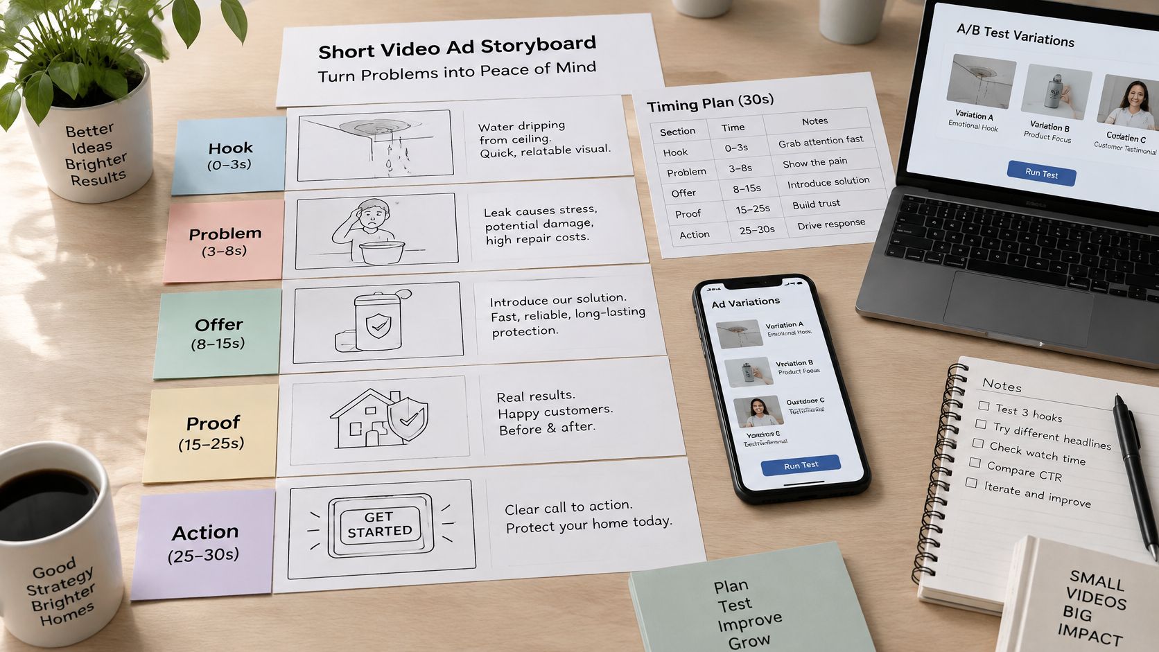
Write Hook Problem Offer Proof and Action
| Beat | Picture and line | Failure if this beat is weak |
|---|---|---|
| Hook | Stained ceiling; sudden leak named | Viewer cannot tell what the ad is about |
| Problem | Soaked apartment and the repair burden | Offer arrives with no reason to care |
| Offer | Sudden water damage and a quote, no invented price | Viewer knows the pain but not the product |
| Proof | One pre-approved trust line | Offer feels unsupported or overclaims |
| Action | Start your quote, same words as the button | Click and page ask for different things |
Hook in the first two seconds
Seconds 0 to 2 show the stained ceiling and name the sudden leak in plain words. The visual does the targeting, because a tenant recognizes the setting without a voiceover explaining it. Nothing else belongs here. A logo build, a greeting, or a rhetorical setup spends the only seconds the viewer has guaranteed. Weakness at this point is fatal, since every later beat depends on the viewer knowing what they’re looking at.
Problem from two to five seconds
Seconds 2 to 5 stay inside the apartment. A soaked rug, a moved sofa, and a tenant on the phone about repairs show the burden in concrete terms. No premium appears yet, and no savings claim sneaks in, because price talk before the problem lands reads as sales pressure. The failure mode is vagueness. Generic worry gives the offer nothing to answer, while a specific mess gives the next line a reason to exist.
Script discipline matters here, and a structured approach to how to write an explainer video script keeps each beat to one job. Read the problem lines aloud and cut any sentence that explains the company instead of the tenant’s situation. The viewer should feel understood before they’re asked to consider a product.
Offer from five to nine seconds
Seconds 5 to 9 introduce the policy in direct language. The on-screen line says the cover addresses sudden water damage, and it names a quote as the next step. Don’t invent a price to make the offer feel concrete. An unverified number creates legal risk and sets an expectation the quote form may not match. Clarity, not a made-up figure, makes this beat strong.
Proof from nine to twelve seconds
Seconds 9 to 12 carry exactly one line that legal or compliance has already approved. That could be licensed status or a clear claim step, written in words the company can defend. It can’t be an unverified result, a borrowed rating, or a testimonial the team hasn’t cleared. Teams that later build longer proof assets can learn from guidance on filming customer success stories, but a 15-second purchase cut has room for one checked line, not a story.
Stacking proof points weakens all of them. Two claims in three seconds turn into noise, and a claim that also tries to close the sale does neither job well. Keep the line short enough to read at phone size, hold it long enough to finish, and let the final beat handle the ask.
Action from twelve to fifteen seconds
Seconds 12 to 15 show Start your quote in the same words as the ad button and the landing page heading. The brand name sits beside it, the frame holds still, and nothing new enters. That stillness is deliberate. A moving end card with fresh information forces the viewer to read and decide at the same time, and most won’t do both.
Timing each beat against the table exposes missing pieces fast. If the offer line runs long, proof gets squeezed. If proof runs long, the action frame flashes past. A 6-second placement can’t carry all five beats, so it keeps only the hook and the action. That’s a structural decision, not a failure of editing speed.
Set Length and Ratio for Each Placement
A skippable ad gives viewers an exit after five seconds. A vertical feed ad gives them a quick swipe. Build for that freedom: show the situation and the action early, before any brand sting. For a renters-insurance ad, that might mean opening on a ceiling stain and a clear prompt to start a quote. Then adapt the same idea to each placement.
| Placement | Duration rule | What to keep |
|---|---|---|
| YouTube skippable in-stream | The skip option appears after 5 seconds | Establish the problem and action before the skip, then use the remaining time for the other beats |
| YouTube non-skippable in-stream | 15 seconds | All five beats |
| YouTube bumper | 6 seconds | Hook and quote action only |
| YouTube Shorts | 9:16; use a 9-second three-beat or 15-second five-beat cut | Hook, offer, action in the three-beat cut; all five beats in the longer cut |
| Meta feed | 15-second five-beat cut; use 1:1 or 4:5 | All five beats |
| Meta Stories and Reels | 9:16; use a 9-second three-beat or 15-second five-beat cut | Hook, offer, action in the three-beat cut; all five beats in the longer cut |
| TikTok in-feed | 9:16; use a 9-second three-beat or 15-second five-beat cut | Hook, offer, action in the three-beat cut; all five beats in the longer cut |
Check the YouTube ad specs, Meta Ads Guide, and TikTok Ads Help when preparing files, since platform requirements can change. For planning, the cuts above give the creative team a workable starting point. Guidance on choosing the ideal length for an online video can help settle debates about whether a placement needs a shorter or longer version.
Map the same scenes onto each row
Carry one renters-insurance concept across two ratios. In a 1:1 or 4:5 feed cut, keep the ceiling stain, soaked rug, and quote prompt within the frame. In a 9:16 cut for Shorts, Stories, Reels, or TikTok, rearrange those same elements vertically. The idea stays consistent; the composition changes to fit the screen.
A crop alone can lose the drip, hide the pan, or push text out of view. Reposition each element, leave room around the edges, and check that platform controls do not cover the quote prompt. A polished film still fails if viewers cannot tell what to do.
Respect completion and file weight
A large-scale academic analysis of approximately 257 million ads found that a 15-second ad was 2.9% more likely to complete than a 20-second ad, while a 20-second ad was 3.9% more likely to complete than a 30-second ad. The analysis also found that approximately one-third of abandonments occurred in the first quarter. Shorter cuts can help, but the opening still needs to make the situation and action clear.
Prepare a high-quality master and ready-to-serve versions suited to different devices and connections. Then check playback, audio, captions, click behavior, and tracking on mobile before launch. A file that stalls interrupts the ad before its message has a chance to work.
Make the Message Work with Sound Off
Silence is the default for feed, Stories, Reels, and Shorts placements. Many viewers keep volume at zero on trains, in offices, and beside sleeping partners, so the recorded message has to read like a poster that moves. Voice and music can support placements where sound is common, but they can’t be the only route to the offer.
Burn captions into the picture instead of trusting a player control. A caption setting buried behind a menu might as well not exist for a 15-second spot. Burned-in lines travel with the file into every placement, render at the size you chose, and appear at the exact second you timed. A production step using a tool to add text to video keeps that text consistent across exports, so the square and vertical cuts carry identical wording.
Would this line still make sense if the volume stays at zero?
Apply that question to the action frame first. Start your quote must stay visible for the full final beat, large enough to read on a phone held at arm’s length, and clear of the profile row, progress bar, and call to action button that each platform draws over the picture. If a platform control covers the verb, the ad ends with a picture and no instruction.
Design for reading, not decoration
Keep one line on screen at a time. Short lines let a viewer finish reading before the cut, while stacked sentences force a choice between watching and reading. High contrast matters more than brand color purity at small sizes, so test the caption against the lightest frame in the scene, usually the ceiling itself. Pale type on a pale ceiling disappears, and no viewer will work to recover it.
The picture still has to carry meaning if text fails. A stained ceiling, a drip, and a pan communicate water damage without a single word, which gives the caption a supporting role instead of the whole burden. Check each frame with captions hidden, then with sound muted and captions shown. Both passes should leave the situation, the product, and the next step intact.
Small checks prevent expensive silence. Watch the exported file, not the timeline preview, because compression can soften thin type. Compare the 9:16 and 1:1 exports side by side, since a line that fits the square frame may wrap awkwardly in the vertical one. Fix wording at the script stage rather than shrinking type at export, because smaller text is where silent comprehension goes to die.
Test One Change and Clear the Policy Check
A polished ad can still fail if viewers cannot tell what to do. Test the approved 15-second quote cut by changing one variable at a time: the first frame, an approved proof line, or the action verb. Keep the rest fixed, then compare versions by started quotes, the action the campaign is meant to drive. Use video success metrics that match your campaign goal rather than treating views as the result.
Reshooting the full message for each audience changes too many things at once. Lighting, pacing, faces, and wording may all shift, making it hard to identify what affected quote starts. Keep the scenes and timing steady while testing one element, whether the ad runs in a standard in-feed unit or as TikTok Spark Ads, where the native presentation can change how the opening reads.
A small team may need multiple cuts, opening frames, and proof lines from one approved script. A template can make revisions easier to manage without rebuilding each video. Wideo’s editor lets users change text and colors to match their brand, and its video production service can create a customized template clients can use to make a variety of videos without previous experience. Wideo’s online video maker also uses templates to help people create professional videos for marketing, internal communications, social media, and more.
Keep the workflow controlled. Approved policy details go into the relevant scenes, and a newly approved offer or proof line triggers an updated version. Name each export by the variable it tests, so the team can distinguish the files and compare results. This turns one approved script into a clear set of variants rather than a folder of near-duplicates.
Clear the policy gate before spend
- Claim accuracy: The water damage line matches what the policy covers.
- Targeting language: The copy does not refer to personal attributes.
- Caption match: Spoken and captioned lines say the same thing.
- Page match: The landing page repeats “Start your quote.”
- Proof sign-off: A compliance reviewer approves the proof line.
Check current platform policies before launch, especially for insurance copy involving eligibility, cover limits, or claims. A rejected ad can delay launch; a misleading one can create a larger problem.
Do your first frame and quote button still point to the same action?
Build the next paid spot around one clear action and an opening that makes the situation understandable. Visit Wideo to turn the approved script into a template, then change its text and colors as you prepare test versions. Keep each variant tied to the quote, lead, or purchase it was designed to drive.