
In a world saturated with information, the standard slide deck no longer captures attention. The challenge for marketers, leaders, and communicators isn’t just to share information, but to create a memorable experience. This requires moving beyond tired templates and embracing new, dynamic approaches that resonate deeply with an audience. The difference between a forgotten slideshow and a career-defining moment often comes down to one thing: creativity.
This guide provides a comprehensive catalogue of practical and actionable ideas for a creative presentation. We’ve curated powerful strategies designed to transform your message from a simple monologue into an engaging, persuasive, and unforgettable event. These aren’t just abstract theories; they are specific, actionable techniques complete with examples and tips to help you captivate your next audience and achieve your communication goals.
Whether you’re a marketing manager pitching a new campaign, a non-profit leader inspiring donors, or a corporate trainer engaging your team, these techniques will provide the inspiration you need to stand out. From leveraging the Hero’s Journey for storytelling to incorporating interactive gamification, you will find fresh methods to ensure your message is not just heard, but remembered and acted upon.
1. Sketchnoting & Visual Note-Taking
Sketchnoting transforms a standard monologue into a dynamic visual dialogue, combining handwritten text, drawings, and structural elements like arrows and containers in real-time. Instead of passive listening, your audience watches a visual story unfold, which dramatically increases engagement and retention of complex information. This technique creates a tangible, shareable artifact of your presentation, extending its impact long after you’ve finished speaking.
This approach is one of the most effective ideas for a creative presentation because it makes abstract concepts concrete and memorable. It’s particularly powerful for explaining processes, strategic frameworks, or customer journeys.

Why It Works & When to Use It
Sketchnoting taps into the brain’s ability to process images far faster than text, making it ideal for audiences that need to grasp intricate ideas quickly. Pioneered by figures like Mike Rohde and popularized by Sunni Brown, author of The Doodle Revolution, this method is used in high-stakes environments like TED talks, SXSW conferences, and corporate training sessions at companies such as Google and McKinsey.
Use it when you need to:
- Simplify Complexity: Break down technical jargon or multifaceted strategies into easily digestible visual components.
- Boost Engagement: Keep audiences focused during data-heavy sessions or long workshops.
- Enhance Recall: Create a unique visual record that attendees can refer to later, reinforcing key takeaways.
How to Implement It
You don’t need to be an artist to start. Focus on capturing core ideas, not creating a masterpiece.
- Start Simple: Begin with basic icons (lightbulbs for ideas, clouds for thoughts) and connectors (arrows for flow, boxes for grouping).
- Use Color Strategically: Assign one or two colors to highlight key themes or action items. Overusing colors can create confusion.
- Practice Your Layout: Before presenting, sketch a rough structure of how the information will flow on your canvas, whether it’s a whiteboard, easel, or tablet.
- Embrace White Space: Avoid cramming your canvas. Negative space guides the eye and prevents visual overload.
2. Storytelling with the Hero’s Journey Framework
The Hero’s Journey transforms a presentation from a simple information transfer into an emotionally resonant narrative. This framework positions your audience or client as the “hero” facing a challenge. You, as the presenter, act as their guide, leading them through stages like the call to adventure (the problem), crossing the threshold (adopting your solution), trials and tribulations (implementation challenges), and ultimately, transformation (achieving their goal).
This narrative structure is one of the most powerful ideas for a creative presentation because it creates deep emotional connections and makes your core message incredibly persuasive. It’s ideal for case studies, brand stories, or pitch decks where you need to inspire action.
Why It Works & When to Use It
Popularized by mythologist Joseph Campbell and adapted for business by figures like Donald Miller, the Hero’s Journey taps into universal patterns of human experience. This makes your message feel familiar and significant. Companies like Apple and Nike use this framework to build brand loyalty, turning customers into advocates. Brené Brown’s viral TED talks often follow this structure, making complex psychological concepts relatable.
Use it when you need to:
- Inspire Action: Motivate your audience to adopt a new idea or product by showing them a clear path to success.
- Build Empathy: Help stakeholders understand the customer’s struggles and the value of your solution on a deeper level.
- Make a Message Stick: Create a memorable and persuasive narrative that resonates long after the presentation ends.
How to Implement It
Focus on making the audience the protagonist of the story, not your company or product. Your solution is the tool that helps them win.
- Define the Hero & Their Goal: Clearly identify your audience and what they want to achieve.
- Introduce a Clear Villain: The “villain” isn’t a person but the problem they face, such as inefficiency, lost revenue, or market competition.
- Outline the Journey: Map out the stages: the initial state of the world, the inciting incident, the challenges they’ll face, and the final victory. A well-planned storyboard can help visualize this flow.
- Show Transformation: Conclude by showing how the hero is transformed after using your solution. For additional resources on structuring narratives for impact, explore guides such as The Art of Storytelling Prompts.
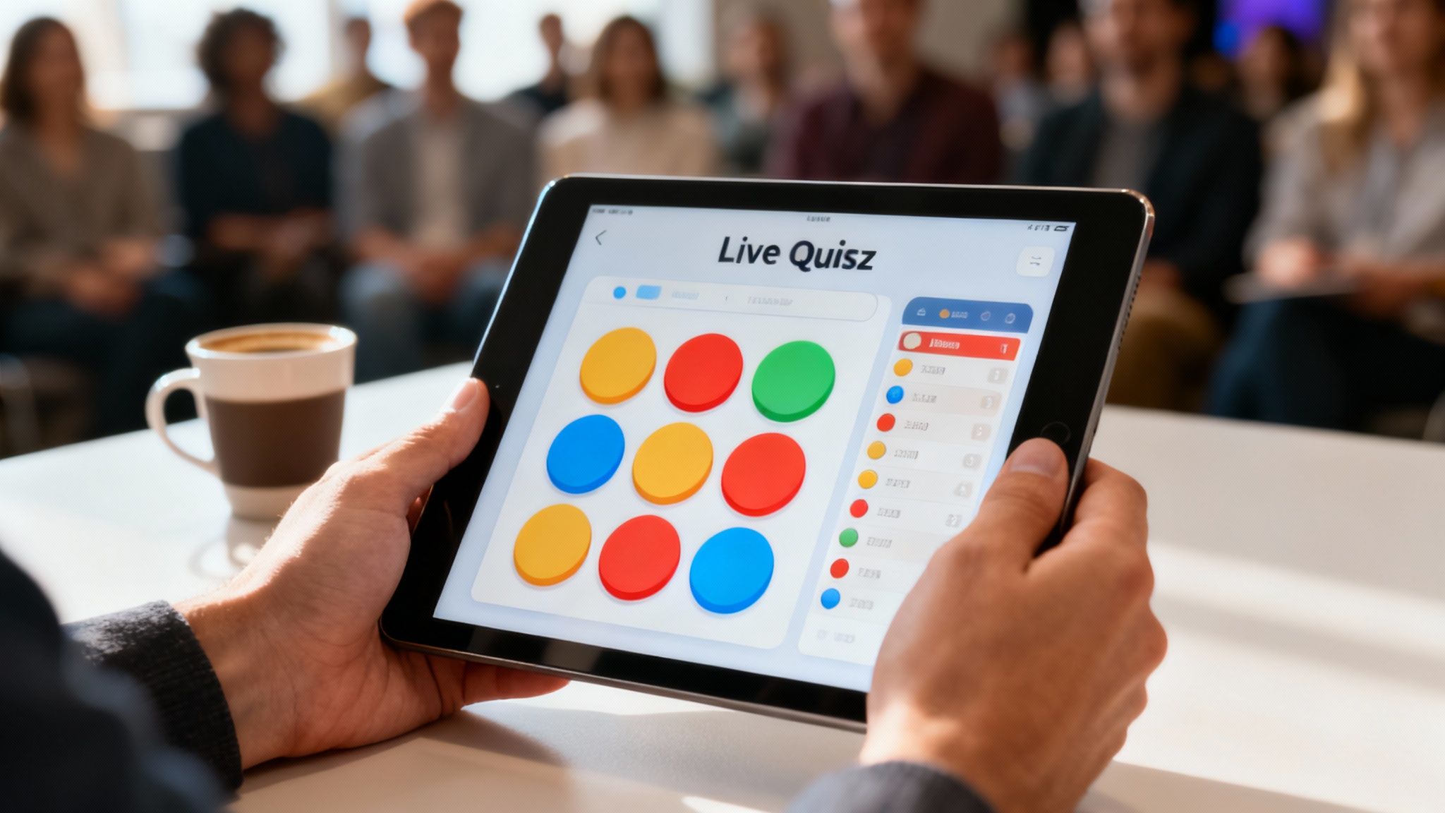
3. Interactive & Gamified Presentations
Interactive and gamified presentations transform a passive monologue into an active, participatory experience by integrating elements like quizzes, polls, and challenges. Instead of simply listening, the audience becomes a crucial part of the narrative, directly influencing the flow and outcome. This active involvement turns the presentation into a memorable event, significantly boosting engagement and message retention.
This approach is one of the most powerful ideas for a creative presentation because it leverages the human desire for play and competition to create a deeper connection with the content. It is exceptionally effective for training, product demonstrations, and conference keynotes where audience focus is paramount.

Why It Works & When to Use It
Gamification taps into psychological triggers like achievement and reward, making learning feel less like a task and more like a game. Platforms like Kahoot! have revolutionized education with this model, while tools like Slido and Mentimeter have made live polling a staple at major tech conferences and corporate all-hands meetings. Marketing strategists also use interactive elements to capture real-time feedback and generate buzz. Learn more about how to create engaging interactive videos on wideo.co.
Use it when you need to:
- Energize the Room: Break the monotony of a long conference or all-day training session.
- Gather Real-Time Data: Use live polls to gauge audience understanding or collect valuable market insights.
- Reinforce Key Concepts: Solidify learning points with competitive quizzes and challenges that make information stick.
How to Implement It
Success depends on seamless integration, not just adding games for the sake of it.
- Choose the Right Tool: Select a platform that matches your audience’s tech-savviness and your presentation environment (e.g., Slido for professional settings, Kahoot! for high-energy training).
- Align with Your Message: Ensure every interactive element directly reinforces a key takeaway. A random quiz can be distracting, but a quiz about your core message is powerful.
- Test Everything: Do a full run-through of all interactive components to prevent technical glitches from derailing your presentation.
- Keep It Simple: Don’t overwhelm the audience with complex rules. The goal is engagement, not confusion. A simple poll or a quick leaderboard challenge is often most effective.
4. Minimalist & Data Visualization Design
Minimalist design strips away non-essential elements, focusing the audience’s attention entirely on the core message. It leverages clean typography, strategic white space, and sophisticated data visualization to convey complex information with elegance and clarity. Instead of distracting graphics, this approach uses simplicity to build authority and let the data tell its own powerful story.
This method is one of the most impactful ideas for a creative presentation because it respects the audience’s intelligence, delivering insights without clutter. It is especially effective for financial reporting, scientific findings, or any scenario where data integrity is paramount.

Why It Works & When to Use It
This approach is rooted in the principle of “less but better,” famously championed by designer Dieter Rams and mastered in presentations by Steve Jobs. It follows the data visualization principles of experts like Edward Tufte, who argues for maximizing the “data-ink ratio.” By removing chart junk like 3D effects and unnecessary gridlines, the data becomes the hero.
Use it when you need to:
- Convey Authority: Present complex data, financial results, or market analysis with precision and credibility.
- Maximize Clarity: Ensure your key message is understood immediately, without cognitive friction.
- Create Sophistication: Build a modern, professional, and high-impact aesthetic that reflects a well-reasoned argument.
How to Implement It
The goal is intentional simplicity, not a lack of effort. Every element must earn its place on the slide.
- Apply the 5-Second Rule: Can an audience member grasp the main point of your slide within five seconds? If not, simplify it further.
- Replace Bullets with Visuals: Instead of a list, use a single high-quality image, a powerful statistic, or a clean chart to make your point.
- Master Typography: Choose a single, highly readable font family and use size, weight, and color to create a clear visual hierarchy.
- Let Your Visuals Breathe: Use generous white space (margins and padding) to guide the eye and prevent the slide from feeling cramped or overwhelming.
5. Immersive & Virtual Reality Presentations
Immersive and virtual reality presentations transport your audience from passive viewers into active participants within a 3D digital environment. Instead of looking at a screen, they are placed inside the content, able to interact with products, explore virtual spaces, or visualize complex data in a fully realized world. This method creates powerful, multisensory experiences that are not just seen but felt, making an unforgettable impact.
This approach is one of the most forward-thinking ideas for a creative presentation because it breaks the physical boundaries of a traditional venue. It’s exceptionally effective for product demonstrations, virtual tours, and complex training simulations where hands-on experience is critical.
Why It Works & When to Use It
VR and AR tap into our innate spatial and kinesthetic learning capabilities, creating deep emotional and cognitive connections. This technology, championed by visionaries like Meta’s Mark Zuckerberg and Oculus founder Palmer Luckey, allows for experiences that are impossible to replicate with slides or videos. Companies like Walmart use VR for employee training, while Volvo offers virtual test drives, proving its commercial value.
Use it when you need to:
- Demonstrate Scale & Detail: Allow users to explore a new real estate property, a complex piece of machinery, or a new car model from the inside out.
- Simulate High-Stakes Scenarios: Provide safe, repeatable training for medical procedures, emergency responses, or technical repairs.
- Create an Emotional Connection: Transport potential donors to a community they are supporting or let customers experience a travel destination before booking.
How to Implement It
Successful VR/AR presentations prioritize user experience and purposeful design over novelty.
- Start with AR: Use augmented reality apps to overlay digital information onto the real world. This is more accessible as it often only requires a smartphone.
- Prioritize Comfort: Keep experiences short and be mindful of motion sickness. Provide clear instructions and a safe physical space for participants.
- Focus on Value, Not Gimmicks: Ensure the immersive element serves a clear purpose, such as clarifying a complex concept or demonstrating a unique feature.
- Test Extensively: Run trials with a diverse group of users to identify potential technical issues, comfort problems, or confusing instructions before the main event.
6. Presentation as Performance Art
This approach transforms your presentation from a simple talk into a full-fledged theatrical experience, incorporating staging, lighting, sound design, and dramatic pacing. The goal is to create an emotionally resonant event that captivates the audience on a sensory level, blurring the line between information delivery and entertainment. This method ensures your message is not just heard, but felt.
Treating your talk as a performance is one of the most ambitious ideas for a creative presentation because it creates a powerful, immersive experience. It’s especially effective for high-stakes announcements, brand storytelling, and product launches where making a memorable impact is critical.
Why It Works & When to Use It
This technique leverages the principles of theater to create emotional connection and heighten suspense, making key moments unforgettable. It was famously pioneered by Steve Jobs, whose Apple keynotes were masterpieces of stagecraft and narrative. Today, figures like Elon Musk use it for dramatic Tesla reveals, and production companies like Moment Factory create Broadway-style corporate events that engage audiences completely.
Use it when you need to:
- Launch a Revolutionary Product: Build anticipation and create a sense of occasion that matches the innovation.
- Inspire Action or Investment: Evoke a powerful emotional response to drive commitment and buy-in.
- Define Your Brand: Tell a compelling brand story in a way that solidifies your identity and values in the audience’s mind.
How to Implement It
Success depends on a perfect blend of spectacle and substance. The performance must amplify the message, not overshadow it.
- Align Theatrics with Your Core Message: Every element, from the music to the lighting, should reinforce your key points.
- Control the Environment: Carefully consider venue acoustics, sightlines, and stage design to direct audience focus.
- Use Music and Sound Strategically: A well-chosen soundtrack can set the mood, build tension, and signal important transitions.
- Rehearse Extensively: The execution must be flawless. Practice your movement, timing, and technical cues until they are seamless.
7. Pecha Kucha & Rapid-Fire Formats
Pecha Kucha, a format originating in Japan, forces speakers to be powerfully concise by limiting them to 20 slides, each displayed for only 20 seconds. This rapid-fire constraint (totaling 6 minutes and 40 seconds) eliminates fluff and creates a high-energy, fast-paced experience that keeps audiences completely locked in. Instead of a long lecture, the audience receives a dynamic burst of focused information.
This approach is one of the most disciplined ideas for a creative presentation because its strict rules demand clarity and narrative precision. It’s perfect for introducing new concepts, sharing project updates, or delivering a memorable pitch without losing momentum.
Why It Works & When to Use It
The 20×20 constraint bypasses audience fatigue and forces the presenter to distill their message to its absolute core. Created by architects Astrid Klein and Mark Dytham to prevent long-winded design presentations, its success has led to global Pecha Kucha Night events and inspired similar formats like Ignite talks. The fixed timing builds a natural rhythm and anticipation, making the content more impactful.
Use it when you need to:
- Deliver High-Impact Pitches: Quickly convey a business idea or project value in a compelling, memorable way.
- Share Multiple Ideas: Allow several speakers to present back-to-back in a short amount of time, like at an internal innovation showcase.
- Energize a Conference: Break up longer sessions with short, engaging talks that maintain audience attention.
How to Implement It
Success in this format is all about preparation and ruthless editing. The auto-advancing slides wait for no one.
- One Idea Per Slide: Dedicate each slide to a single, clear point supported by a strong visual. Avoid text-heavy slides.
- Write and Time Your Script: Rehearse your script repeatedly to ensure your talking points for each slide fit within the 20-second window.
- Use Powerful Imagery: Let high-quality images or simple graphics do the heavy lifting. The visual should complement your spoken words, not duplicate them.
- Build a Narrative Arc: Structure your 20 slides to tell a story with a clear beginning, middle, and end to guide the audience.
8. Infographic & Visual Synthesis
Infographic and visual synthesis transforms complex data and dense information into a cohesive, easily digestible visual narrative. Instead of presenting disparate charts and figures, this method organizes them into a single, compelling infographic that reveals relationships, hierarchies, and processes at a glance. The audience can immediately grasp the bigger picture without getting lost in the details.
This approach is one of the most powerful ideas for a creative presentation because it prioritizes clarity and visual logic, making your data not just seen, but understood. It’s ideal for presenting market research, annual reports, or complex project outcomes.
Why It Works & When to Use It
This technique leverages the principles of information design championed by pioneers like Edward Tufte and David McCandless. It makes data memorable and shareable, as seen in the impactful data stories produced by The New York Times graphics department and McKinsey’s visual business insights. It synthesizes information, which is more persuasive than just presenting raw data points. For more background, you can learn more about infographics.
Use it when you need to:
- Tell a Data-Driven Story: Guide your audience through insights with a clear visual path from problem to conclusion.
- Demonstrate Relationships: Show how different variables and data points connect within a larger system.
- Make a Strong Impression: Present findings in a polished, professional format that builds credibility and authority.
How to Implement It
The goal is to simplify, not just decorate. Effective visual synthesis is about editorial choices and clear design.
- Choose the Right Visualization: Use bar charts for comparisons, line charts for trends, and flowcharts for processes.
- Create a Visual Hierarchy: Use size, color, and placement to guide the audience’s attention to the most important information first.
- Eliminate Chartjunk: Remove any visual element that doesn’t add to the understanding, like unnecessary gridlines, borders, or 3D effects.
- Maintain Consistency: Use a limited, consistent color palette and typography to create a unified and professional look.
9. Conversational & Non-Linear Presentations
Conversational presentations abandon the rigid, one-way slide sequence in favor of a dynamic, dialogue-driven format. Instead of forcing an audience down a predetermined path, presenters use branching slides or interactive navigation to adapt the content in real-time, responding directly to audience questions, interests, and energy levels. This transforms a monologue into a collaborative exploration of a topic.
This approach is one of the most powerful ideas for a creative presentation because it respects the audience’s intelligence and priorities. It’s especially effective in sales pitches, client workshops, or any setting where building rapport and addressing specific concerns is more important than covering a fixed agenda.
Why It Works & When to Use It
This method empowers the audience, making them co-creators of the presentation experience. This dramatically increases buy-in and engagement. The technique is a hallmark of modern facilitation methods, championed by group-dynamics experts like David Sibbet and used extensively in agile and design thinking workshops. It is now a standard for high-stakes consulting and executive coaching.
Use it when you need to:
- Customize on the Fly: Tailor a sales presentation to a specific client’s pain points as they reveal them.
- Facilitate Group Decisions: Guide a team through a strategic discussion, exploring different scenarios based on their input.
- Conduct Interactive Training: Allow trainees to dive deeper into modules that are most relevant to their roles.
How to Implement It
Success depends on solid preparation and a flexible mindset. The goal is to be ready for any direction the conversation might take.
- Build a Central Hub: Create a “home” slide with hyperlinked sections, allowing you to jump to different topics non-sequentially.
- Prepare Depth Content: Develop detailed slides for each key topic but only show them if the audience expresses interest.
- Listen Actively: Pay close attention to questions and cues. Let the audience’s curiosity guide your path through the material.
- Allocate Discussion Time: Reserve at least 30% of your total presentation time for unstructured, responsive conversation.
10. Multimedia Integration & Transmedia Storytelling
This approach transforms a presentation into an immersive ecosystem, weaving together video, audio, interactive polls, and social media into a single, cohesive narrative. Rather than a linear slideshow, the audience experiences a story that unfolds across multiple platforms simultaneously, creating a rich, multi-sensory journey that extends beyond the presentation room. This method builds a world around your core message, making it more engaging and memorable.
Multimedia integration is one of the most ambitious ideas for a creative presentation because it creates a deeply layered experience. It is exceptionally effective for product launches, major brand campaigns, or corporate keynotes where you want to generate sustained buzz and audience participation.
Why It Works & When to Use It
Transmedia storytelling, a concept popularized by theorist Henry Jenkins, leverages the unique strengths of different media to tell a unified story. This method is used by global brands like Marvel and Samsung to build anticipation and engagement for major releases. It works by giving the audience multiple entry points into the narrative, catering to diverse consumption habits and keeping them invested over time.
Use it when you need to:
- Create an Immersive Brand World: Build a comprehensive experience for a new product launch or a major company announcement.
- Maximize Audience Engagement: Encourage interaction across various platforms before, during, and after the live event.
- Extend the Message’s Lifespan: Design a campaign where the story continues on social media, websites, or follow-up content.
How to Implement It
Success depends on seamless coordination and a strong central narrative, not just a collection of different media files.
- Unify the Narrative: Ensure every piece of media, from a video clip to a social media poll, contributes to the same core story.
- Plan Your Tech: Test all video, audio, and interactive elements across different devices and platforms well before the event. Have backup plans for potential technical failures.
- Create a Content Calendar: Map out when each multimedia element will be introduced to build momentum and guide the audience journey.
- Maintain Consistent Branding: Use the same visual and tonal identity across all media to create a professional and cohesive experience.
10 Creative Presentation Ideas Comparison
| Method | Implementation complexity | Resource requirements | Expected outcomes | Ideal use cases | Key advantages |
|---|---|---|---|---|---|
| Sketchnoting & Visual Note-Taking | Medium — needs drawing practice | Low — pen/paper or tablet; prep time | Better recall and engagement; personalized summaries | Conferences, workshops, UX research, training | Visual memory, active listening, shareable notes |
| Storytelling with the Hero’s Journey Framework | Medium — requires narrative crafting | Low–Medium — time for story development, coaching | Deep emotional connection and persuasive calls-to-action | Brand messaging, keynotes, fundraising, client pitches | Relatable arc, clear transformation, memorable messaging |
| Interactive & Gamified Presentations | High — tech + flow design | Medium–High — polling tools, devices, tech support | Dramatically increased attention, real-time feedback | Education, training, conferences, product demos | High participation, immediate insights, fun/competitive energy |
| Minimalist & Data Visualization Design | Medium–High — design and data distillation | Medium — design tools, quality visuals, time | Clear focus, reduced cognitive load, professional look | Executive briefings, investor decks, data-heavy talks | Clarity, emphasis on key messages, timeless aesthetics |
| Immersive & Virtual Reality Presentations | Very high — specialized development | Very high — VR/AR hardware, dev team, budget | Exceptional immersion and experiential learning | Simulations, product prototyping, museums, real estate tours | Immersive exploration, strong differentiation, high impact |
| Presentation as Performance Art | High — staging and production | High — production crew, lighting, sound, rehearsal | Strong emotional resonance and memorable experiences | Product launches, large keynotes, theatrical events | Multi-sensory engagement, spectacle, powerful storytelling |
| Pecha Kucha & Rapid-Fire Formats | Low–Medium — strict timing discipline | Low — auto-advance slides, rehearsal time | High pacing, concise messaging, sustained attention | Lightning talks, portfolio showcases, conference sessions | Conciseness, momentum, scalable multiple-speaker events |
| Infographic & Visual Synthesis | Medium–High — design + data skill | Medium — design tools, data, time | Fast comprehension, shareable insights, clarified relationships | Reports, marketing collateral, research summaries | Visual clarity of complex data, cross-cultural accessibility |
| Conversational & Non-Linear Presentations | Medium–High — content depth and flexibility | Low–Medium — branching slides, facilitator prep | Authentic engagement, tailored relevance, dynamic dialogue | Workshops, client meetings, seminars, sales pitches | Audience-driven, adaptive flow, stronger rapport |
| Multimedia Integration & Transmedia Storytelling | Very high — cross-channel coordination | Very high — video/animation teams, platforms, budget | Extended engagement, multi-touch reinforcement, broad reach | Large campaigns, product launches, brand ecosystems | Rich sensory experience, multi-platform reach, prolonged impact |
From Idea to Impact: Your Next Creative Step
Navigating the landscape of creative presentation ideas can feel overwhelming, but the journey from a standard slideshow to a memorable communication event is more accessible than ever. We’ve explored a diverse toolkit of ten powerful techniques, moving beyond the confines of traditional bullet points. From the raw, human connection of sketchnoting and the narrative pull of the Hero’s Journey to the rapid-fire energy of Pecha Kucha and the immersive potential of virtual reality, each strategy offers a unique pathway to captivate your audience.
The central takeaway is this: creativity is a strategic choice, not just an artistic flair. It’s about selecting the right tool for the job. A minimalist, data-centric design might be perfect for a fintech quarterly report, while an interactive, gamified approach could revolutionize an HR training session. The goal isn’t to be different for the sake of it; it’s to be more effective, more engaging, and ultimately, more persuasive. Your message deserves a delivery method that enhances its clarity and ensures it resonates long after the final slide.
Putting Your Creative Vision into Action
Mastering these concepts transforms your role from a mere presenter into a genuine communicator and experience designer. By breaking free from linear, slide-by-slide formats, you respect your audience’s intelligence and time, fostering a dynamic dialogue rather than a one-way lecture. This shift is crucial for marketers trying to cut through the noise, non-profits aiming to inspire action, and corporate leaders seeking to drive change.
To begin your transformation, focus on these actionable next steps:
- Select One Method: Don’t try to implement everything at once. Choose one idea from this list that aligns with your next presentation’s objective and your personal style. Perhaps it’s integrating a single, powerful infographic or structuring your next team update as a conversational, non-linear flow.
- Prototype and Practice: Before going live, storyboard your new approach. If you’re trying storytelling, write out the key plot points. If you’re gamifying, define the rules and the reward. Practice the delivery to build confidence with the new format.
- Leverage Technology: To effectively transition your creative concepts into a compelling presentation, consider utilizing advanced AI-powered presentation tools like PresentationGPT to assist with content generation and structure. This can help you quickly outline a Hero’s Journey narrative or generate visual concepts for a data-heavy section.
By intentionally choosing your method and daring to innovate, you turn a routine requirement into a powerful opportunity. The right creative presentation ideas don’t just share information; they build connections, spark curiosity, and inspire your audience to think, feel, and act differently.
Ready to bring your most dynamic ideas to life with professional-quality visuals? Wideo makes it easy to create stunning animated videos and presentations, even without any design experience. Transform your data, stories, and concepts into engaging visual content by exploring the intuitive tools at Wideo today.