Making an animated presentation is all about turning flat, static data into a story that moves. The secret is using a tool built for the job, like Wideo, to blend text, images, and characters with deliberate motion. This approach guides your audience’s attention and makes even the most complicated ideas a breeze to understand.
Why Animated Presentations Win Audiences
In a world flooded with information, static slides just don’t cut it anymore. They often fail to grab and hold people’s attention. Think about the last presentation you sat through. Was it a marathon of dense, text-heavy slides? If so, you probably remember the feeling of your mind wandering more than the actual content. This is exactly why learning how to make animated presentations is such a game-changer.

Animation isn’t just about adding flashy, distracting effects for the sake of it. When used right, it’s a powerful communication tool. Motion graphics can break down complex processes, shine a spotlight on critical data, and forge an emotional connection that plain text simply can’t. Your brain is hardwired to notice movement and processes images a staggering 60,000 times faster than text, making animation an incredibly effective way to get your point across.
The Power of Visual Storytelling
Imagine a startup pitching to investors. Instead of a bland slide with bullet points listing market size and growth projections, an animated presentation could actually show the market expanding. You could have characters representing happy customers using their product. That visual story is way more compelling and sticks in your memory.
It’s the same for a teacher explaining cellular biology. Animation can take students on a tour inside a cell to see mitochondria at work, rather than just pointing at a flat diagram on a slide. The movement makes an abstract concept feel real and much easier to grasp. This approach elevates your message from a simple report to an unforgettable experience.
The real magic of animation is its ability to translate abstract data into a concrete story. It helps your audience see what you mean, which leads to better understanding and much higher information retention.
When your audience can visualize your message, they’re not just hearing it—they’re experiencing it. That’s the difference between a presentation that’s forgotten the next day and one that leaves a lasting impact.
Choosing the Right Tools for the Job
The demand for more engaging communication has sparked incredible growth in this area. The presentation software market was valued at nearly $6.7 billion in 2024 and is expected to hit $16.3 billion by 2031. This boom is powered by tools that are making professional-level animation easier and more accessible than ever before. You can dive deeper into these insights on presentation software trends to see how the market is evolving.
While old-school programs like PowerPoint have tried to add animation features, they often feel clunky and limited. This is where dedicated platforms really shine, offering a far more intuitive experience. Here’s how they stack up:
- Static Presentations (PowerPoint, Google Slides): These are fine for simple, text-heavy information. But their animations are usually basic and can feel like an afterthought.
- Animated Presentations (Wideo): These platforms are built for motion from the ground up. They give you templates, character libraries, and timeline controls to create smooth, professional-looking animations without a massive learning curve.
Let’s break down the core differences in a bit more detail.
Static Slides vs Animated Presentations
| Feature | Static Presentation (e.g., PowerPoint) | Animated Presentation (e.g., Wideo) |
|---|---|---|
| Audience Engagement | Passive viewing, often leading to disinterest. | Active viewing, keeps the audience focused and curious. |
| Information Recall | Lower retention rates due to text overload. | Significantly higher retention through visual storytelling. |
| Explaining Complexity | Relies on complex diagrams and dense text. | Simplifies complex ideas by showing processes in motion. |
| Emotional Impact | Limited ability to evoke emotion. | Creates a strong emotional connection using characters, music, and dynamic visuals. |
| Brand Storytelling | Can feel generic and disconnected from brand identity. | Brings brand stories to life with custom characters, colors, and fluid animations. |
| Call to Action | CTAs are static text, easily overlooked. | Dynamic CTAs can pop, move, and guide the viewer’s eye, driving higher conversion. |
Ultimately, choosing a tool designed specifically for animation gives you the power to craft a presentation that doesn’t just inform but genuinely captivates your audience from the first slide to the last.
Getting Your First Animation Project Off the Ground
Jumping into a new creative tool can feel like a lot, but I promise getting your first project started in Wideo is surprisingly simple. The trick is to make a few smart decisions right at the beginning. Get these right, and you’ll save yourself a ton of headaches later. Think of it as laying the foundation before you start building.
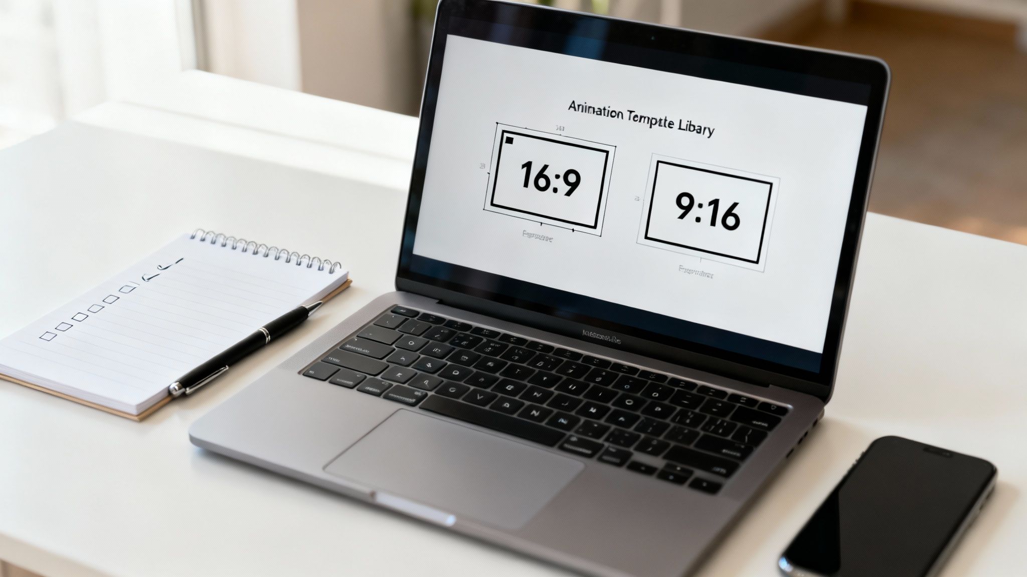
The very first choice you need to make is your project’s orientation, or what’s known as the aspect ratio. This isn’t just some technical jargon; it completely dictates how your audience will see your content.
Are you building a presentation for a widescreen webinar or a big conference display? You’ll want to go with a 16:9 ratio. Is this animation destined for an Instagram Story or maybe a TikTok video? Then you’ll definitely need the vertical 9:16 format. Nailing this down first ensures every single element you add will be perfectly framed for its final destination.
Choosing Your Template Wisely
With your orientation locked in, it’s time for the fun part: exploring the template library. This is a game-changer for anyone learning how to make animated presentations without wanting to pull their hair out. Instead of staring at a scary blank canvas, you get a pre-built structure complete with scenes, placeholders, and even slick animations.
Your job here is to find a template that actually matches the vibe and goal of your message.
I find it helps to think in terms of scenarios:
- Pitching a new product? Look for templates with bold text, dynamic transitions, and obvious spots for a call to action. They’re built to grab attention fast.
- Creating an educational explainer? Opt for designs with clean, simple layouts, lots of space for text, and maybe some friendly characters to help break down complex ideas.
- Rolling out internal training? The templates with a more professional, corporate feel and structured scene flows are perfect for things like onboarding or policy updates.
Getting this initial setup right is where great animated presentations are born. It’s a booming industry for a reason—the animation software market is on track to hit $20.5 billion by 2029, which just shows how much demand there is for these kinds of visual tools.
By picking the right aspect ratio and template from the get-go, you’re doing more than just saving time—you’re basically adopting a proven visual strategy. This thoughtful start makes the entire creation process feel smoother and way more effective.
A good template acts as your creative guide, giving you a solid framework to build your story on. For a closer look at what’s possible, you should check out our guide on presentation video software, which dives even deeper into simplifying this process.
Mastering the Editor and Timeline
This is where the magic really begins. Once you’ve picked your template, you’re dropped right into Wideo’s editor—your new creative command center. It might look like there are a lot of options at first, but don’t worry. The whole experience is built around a simple drag-and-drop system that you’ll pick up in no time.
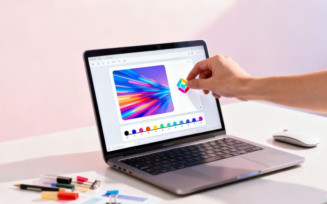
Think of the main canvas as your stage. To the left is your asset library, which is basically your treasure chest. It’s packed with everything you need to build your presentation: characters, props, text boxes, and even royalty-free music. Of course, you can also upload your own assets like a company logo or product shots to keep everything on-brand.
Getting elements onto the stage is as easy as clicking an item from the library and dragging it over. You can resize, rotate, and place it exactly where you want with your mouse, just like in any simple design tool. It’s this instant, visual feedback that lets you start building without getting bogged down in technical stuff.
Understanding Scenes and Your Asset Library
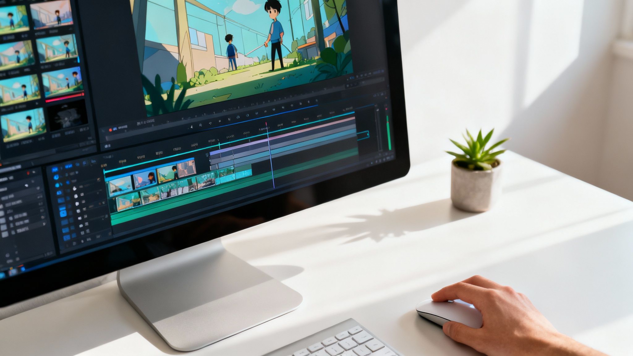
Your entire presentation is constructed from a series of individual scenes. Each scene is like one slide in a PowerPoint deck, but with way more potential for life and movement. You can add, delete, or shuffle these scenes around from the panel on the right, giving you total control over the flow of your story.
Let’s say you’re creating a quick 30-second product demo. You could break it down like this:
- Scene 1: Kick things off with an animated character looking confused about a common problem.
- Scene 2: Introduce your product as the hero—maybe your logo animates in alongside a product shot.
- Scene 3: Show that same character now happily using your product, with text callouts highlighting the best features.
This scene-by-scene structure is great for organizing your ideas and building your narrative one piece at a time. It keeps your message sharp and easy for anyone to follow.
The real power of an animated presentation tool lies in its timeline. This is the single most important feature that separates a static, boring slideshow from a professional, fluid animation that captivates your audience.
Getting comfortable with the timeline is how you control when and how every single element appears, moves, and disappears.
Using the Timeline to Control Everything
Look at the bottom of the editor, and you’ll find the timeline. It’s a visual map of your scene’s duration, usually measured in seconds. Every object you add—a character, a line of text, an image—gets its own track on this timeline.
This is where you become the director. By clicking and dragging the ends of an object’s track, you can control its timing with incredible precision. Want your logo to fade in at the 2-second mark and then slide offscreen at the 5-second mark? You just adjust its track on the timeline. It’s this level of control that gives your presentation that polished, professional vibe.
Here’s a practical look at what you can do:
- Stagger Entrances: Instead of throwing everything on screen at once, bring elements in one by one. This guides your viewer’s eye and makes the information much easier to digest.
- Sync with Voiceover: If you’re using a voiceover, you can line up visual cues to match specific words or phrases for a bigger impact.
- Control Pacing: Use the timeline to build in pauses, speed up a transition, or hold on a key visual to really let a point sink in.
If you want to get really fancy with your text, our tutorial on how to animate text like a pro has some awesome tips you can apply directly in the timeline. Ultimately, mastering the timeline is what separates an okay animated presentation from a truly great one.
Bringing Your Story to Life with Motion and Sound
Once your scenes are built out and your timeline looks good, it’s time for the fun part: adding the motion and sound that truly bring a presentation to life. These are the elements that separate a forgettable slide deck from a dynamic, memorable experience. This is where you learn to make animated presentations that don’t just dump information on your audience but actually create a mood and guide their focus.
Animation isn’t just about making things fly across the screen. Its real power is in subtlety and purpose. You can use simple effects to pull attention to the most important part of a scene. In Wideo, applying pre-set animations like fades, slides, and bounces to any object or text only takes a couple of clicks.
The key is to think like a director. When a new piece of data appears, a gentle “fade in” effect is often all you need. If you’re revealing a key benefit, a subtle “slide in” from the side gives it just the right amount of punch without being distracting.
Adding Movement with a Purpose
Imagine you’re presenting a new app. As you introduce a killer feature, you can have its icon gently bounce or pulse on screen. That tiny bit of movement instantly tells your audience, “Hey, look over here!” It’s a simple trick, but it’s incredibly effective at directing attention where you want it.
Here are a few practical ways I use animation with intention:
- Emphasize Data: Make a key statistic or number grow slightly in size to make sure it gets noticed.
- Guide the Narrative: Animate a character to point towards an important piece of text.
- Create a Smooth Flow: Use consistent slide transitions to connect your scenes into one cohesive story.
The global animation market is projected to hit a staggering $400 billion by the end of 2025, which just goes to show how much businesses are investing in motion to tell their stories. The goal of animation is to make your message clearer, not more complicated.
A well-placed animation should feel completely natural. The best motion effects are the ones the audience doesn’t consciously notice but that successfully guide their eyes and improve their understanding.
Layering in the Perfect Audio
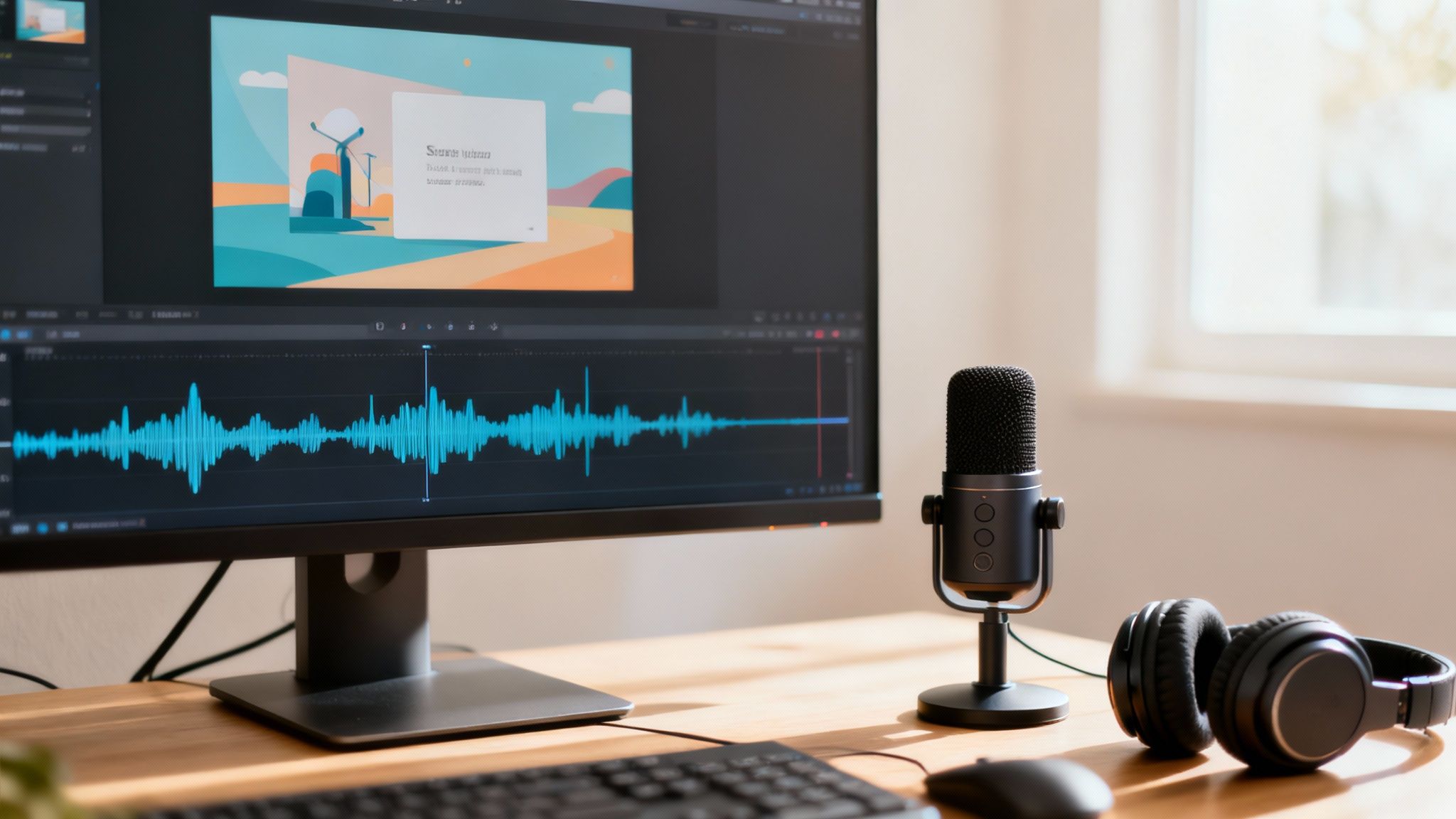
Now for the other half of the equation: sound. The right audio can completely transform the tone of your presentation, turning a dry report into an engaging journey. Wideo gives you several options for adding audio, and each has its own strengths.
You can easily browse the built-in library of royalty-free background music to find a track that matches your brand’s vibe—whether that’s upbeat and energetic or calm and professional. You can also upload your own audio files, which is perfect if you have specific brand jingles or custom sound effects you want to use.
For many presentations, the most powerful tool is recording a voiceover directly inside the editor. This lets you narrate your story, explain complex charts, and add a personal, human touch to your animation. A clear voiceover provides context that visuals alone just can’t.
To make sure your audio hits the mark, check out our guide on how to use audio in video for tips on balancing music and voice. By pairing deliberate motion with crystal-clear audio, you create a complete sensory experience that keeps your audience hooked from start to finish.
Sharing and Optimizing Your Animated Presentation
You’ve created a stunning animated presentation—that’s a huge win. But don’t pop the champagne just yet. The final, and arguably most critical, phase is getting your masterpiece in front of your audience in the most effective way. This is where you switch gears from creator to strategist, making sure your message lands with maximum impact.
Your sharing strategy should link directly back to your presentation’s purpose. Inside Wideo, you’ve got a few options, each designed for a different scenario. You can download your project as a high-quality MP4 file, which is perfect for a big-screen keynote where every pixel counts. Or, you can share it directly to platforms like YouTube to start racking up views right away.
Choosing the Right Export Format
Before you hit export, think about where your audience is going to see this. Sending a massive, high-res file in an email marketing campaign is total overkill—it probably won’t even get delivered. A compressed version is the smarter play here. The real goal is to match the file type and size to the channel you’re using.
Here are a few common situations I run into:
- Live Events & Keynotes: Always, always go for the highest-resolution MP4 download. You need crisp, clear visuals with zero risk of buffering.
- Email Campaigns: Use a smaller, compressed MP4. I often embed a GIF preview that links out to the full video hosted online to keep the email light.
- Social Media: Wideo’s direct sharing to YouTube is a fantastic time-saver. For other platforms, download the right format—and don’t forget the 9:16 aspect ratio for Stories and Reels.
The best presentations aren’t just well-made; they’re well-delivered. Your export and sharing choices are just as important as the animations because they directly shape the viewer’s experience.
Optimizing for Different Platforms
One of the coolest things about learning how to make animated presentations is just how flexible the final product can be. Don’t think of it as a one-and-done asset. With just a few simple tweaks, one core presentation can be repurposed for a dozen different channels, seriously boosting its ROI.
You could even create slightly different versions for A/B testing. Maybe change the call-to-action in the final scene or swap the background music to see what clicks with your audience. This data-driven approach turns your animation into a seriously powerful marketing tool.
For anyone delivering their content live, staying in control of the flow is everything. To nail complex cues and keep your animated presentation running smoothly, advanced tools like a Stream Deck can be a lifesaver. You can learn more from this Ultimate Guide to Customizing Your Stream Deck to see how it helps manage presentations flawlessly. By planning your sharing and optimization strategy from the get-go, you ensure all your hard work gets the spotlight it deserves.
Common Questions About Animated Presentations
Even with the best tools, a few questions always pop up when you’re just getting started with animated presentations. Working through these common sticking points is how you really sharpen your skills and start creating with confidence. Let’s get into some of the most frequent questions I hear from creators.
One of the first things people want to know is, “How long should my animated presentation actually be?” The honest answer? As short as you can possibly make it without losing the core message.
People’s attention spans are short. If you’re making a marketing or explainer video, you should be aiming for the 60-90 second sweet spot. For something like internal training or a deep-dive report, you can certainly go longer, but it’s a good idea to break the content into clear, distinct chapters to keep your audience locked in.
Another big one revolves around keeping everything looking consistent. How do you stop your presentation from feeling like a random jumble of pictures and text? The secret is a simple style guide you set up before you even start dragging and dropping.
Maintaining a Professional Look
A cohesive look and feel is what makes your presentation seem polished and authoritative. It’s not as hard as it sounds. Just nail down a few key elements and stick with them from start to finish.
- Color Palette: Pick two main colors and one accent color. Use these consistently for your backgrounds, text, and any important objects. This alone creates a huge sense of unity.
- Font Choice: Settle on one font for your headlines and another for the body text. Make sure they’re clean, easy to read, and work well together.
- Character Style: If your video features animated characters, commit to a single style. Whether it’s 2D flat design or more 3D-style characters, mixing and matching can look jarring and unprofessional.
This little bit of discipline is what separates the pros from the amateurs. It keeps your audience focused on what you’re saying, not on visual clutter.
The most effective animated presentations use a limited, consistent visual language. This restraint is what separates amateur work from professional results, as it keeps the audience focused on the message, not the clutter.
Optimizing Your Workflow
“Is there any way to make this process faster?” I get this question all the time. The key to moving quickly isn’t about rushing the creative part; it’s all about smart preparation.
Before you even launch your animation software, your script should be final and your storyboard should be sketched out. When you know the story you want to tell from the beginning, you eliminate hours of endless tinkering and revisions down the road.
As you build your presentation, you might pull in different visual assets. If you’re ever unsure about their origin, it can be helpful to know how to identify AI-generated images. This skill helps you make sure your content is authentic and maintains the integrity of your work.
Finally, people often worry if they need to be an artist to pull this off. The answer is an emphatic no. Modern tools are built to empower people who aren’t designers. By using pre-built templates and asset libraries, you can put all your energy into the story. Think of yourself as a storyteller first, not a graphic designer.
Ready to stop asking questions and start creating? With Wideo, you have all the templates, tools, and intuitive controls you need to build stunning animated presentations in minutes. Start your free trial today and bring your story to life.